Monday, November 8, 2010

The Gregory Master Bathroom


For this project I designed an accessible master bathroom for the Gregory home. Three themes I tried to carry out in this design were warmth, romance, and calming. This bathroom incorporates my original concept model in the way it plays with light. The focus wall has a treatment with the paint that uses subtle gold flecks. Dimmer lights set within foe candle fixtures and lighting behind the mirrors create a soft glow when desired. Dark, but warm colors and a rustic sand stone floor give the room medieval feel. The other idea behind this room design was to create a bathroom that did not look like it was designed for a person with disabilities. I feel I created this idea successfully with there being only two telling details; grab bars around the toilet and lowered fixtures. The shower is large enough to roll in with an accommodating wheel chair and do a full 5ft. turn around with out grab bars or special seating.
One thing I feel I could have done better with this assignment was create a more appealing presentation board. It doesn't necessarily represent my design very well or interestingly enough.


Wednesday, November 3, 2010

Wheelchair Experience


What an eye opening experience! For this project I had to use a wheelchair to get down from one building, across a parking garage, into a library, and into an "accessible" bathroom stall. Let me start by saying no one has any idea how difficult this really is until they've had to do it. By experiencing this for only a half an hour I learned that handicap "accessible" features are not always so accessible. Doors, though wide enough for the chair to get through, were heavy and difficult to open because you were required to pull them open, not an easy task when you also have to wheel backwards! Chairs that got left out in the walk ways that would otherwise be fine for someone who could walk around them, had to be pushed in before the chair could fit around them. Some of the bathroom stalls that were supposed to be accessible did not have enough room next to the toilet for transfer and some even though they had grab bars, had a shelf right above the grab bar, making it difficult to not hit your head as you tried to brace yourself up onto the toilet. The chair was difficult to control, especially when going down the hill, at some points I thought I was going to crash or seriously hurt my had trying to brace the wheels for turning. this experience defiantly made me more aware of the accessible features I need to think about and include in my designs.

Monday, October 25, 2010

The Gregory Twin's Bedroom


Imagine. Create. Play. These were the ideas the inspired the design of the Gregory Children's room. I first selected the book, "Where the Sidewalk Ends" by Shel Silverstien to draw inspiration for a child's room. From this I came up with the concepts of Imagine. Create Play. because the book inspires kid's to think creatively, dream widely, and enjoy playing like every kid should. I especially loved one of the pictures from the book, of two kid's in big boxes with faces drawn on them. From this I created several study models until finally landing on a concept that truly represented my ideas. The next step was to create a space for the twin boys that allowed them to play, have guests, study, and do all these things separately from each other if they wished. Through funky shaped furniture, separate chalk boards to draw on, easy access storage space, trundle beds and a separate cove for studying the room is defiantly ready for the twins.
I feel I was pretty successful in meeting the requirements for this project, however I feel I could have given the room some more character with a little more time to work on it. While it looks great, I feel it could be personalized to the twins a bit more.


The Gregory Kitchen


For this project I was faced with the challenge of designing a kitchen to be used for entertaining and cooking by both Mr. and Mrs. Gregory. This was hard because Mrs. Gregory is limited by what she can reach because of her wheelchair. For their kitchen I wanted to create a warm, open, inviting place that allowed for the Gregory's to socialize with their guests while preparing a meal. I chose rustic colors and hard wood floors to keep the integrity of the old Combine building the apartment resides in. The kitchen has a long, open view of the living room the also serves as a bar for guests. The open flow of the kitchen allows for the Gregory's to move around with out interfering with each other.
I feel I was very successful at creating a cohesive design for this kitchen. I allowed for 2 contrasting colors to tie in with all the red's happening around the space and designed an ideal space to entertain. If I could do something differently, I would have designed a bigger floor space to allow for a island with 5ft of walk space between the counters.


Concept Model


Building a concept model to draw inspiration from is a tough task to accomplish. How do you create feelings or ideas into physical form that will have greater effect over all your designs?! For this project I chose to use the Genesis Song, Home By the Sea, to best some up my feelings about a home. From this song I drew out several ideas about the way light comes through a home and how it over all effects the feeling in a home. From this I created several parti drawings, trying to capture in 2d form my ideas about light. Then after selecting one parti, I created several mock-up models and finally, a final concept model. This model has played a big part in designing the Gregory house, not only in my use of light, but in the way the rooms are structured.I feel I was fairly successful in designing what I was trying to take from the song. One thing I could have done better was to explore other materials to create my model.

Wednesday, April 28, 2010

Poster


This is a poster created in InDesign of my Room Concept from Id 102. We had to create an abstract room from a quote by our designer and a natural object. I feel like this has been my most sucessful project. I really enjoyed making the 3d Model. I feel I fianlly grasped the "Abstract" concept with this project too, something I have been struggling with all semester.

Monday, April 19, 2010


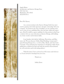
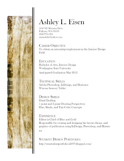
These pages are my resume,references,and cover letter. I was very pleased with how the template for my pages came out and looked great with all the sections. This project familiarized me more with Adobe Illustrator and creating a template for all my pages

Monday, April 12, 2010

Logo


This is a logo idea developed in class. I was going for more of a vintage feel, but it's come out looking more New Orleans. Not really sure if I like it or will actually use it.

Monday, March 29, 2010

Sketches


These are a few sketches done in class. The two pieces of furniture were my first experiences with one point perspective drawing. The sketch of the room corner was a second assignment in which I had to use one point perspective.

Wednesday, March 24, 2010

Textile Pattern


This project was a digital textile created with aspects of my own heritage. Scottish decent is a proud heritage to carry. Emphasis is placed on any Scotts man to display their heritage any chance they can by means of displaying their Clan tartan at special events (usually in the way of a kilt)or taking part in honored traditions. Two of the traditions displayed here are the ceremonial Highland dancer, originally done over the shield of a defeated clansmen and a Luckenbooth, given to Scotts women on their wedding day to symbolize health and prosperity which is then pinned to the woman’s first child’s blanket as a protector from evil spirits. This project furthered my experience with Adobe Photoshop and the filter effects. I feel it is clear from the last Photoshop project I have improved.

Quilt Pattern


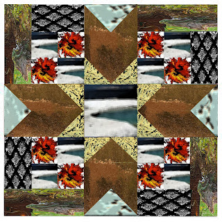
This picture is my first experience with Adobe Photoshop and InDesign. Essentially I took pictures I had taken and distorted them in Photoshop using the effects filters and then in InDesign created a quilt-like pattern to shape the images within. This project helped me become familiar with the programs and how to go about digitally changing images. I feel like this was a good starting point for coming into these programs without a clue.